
?
Explore a collection of vintage travel posters from around the world dating from approximately 1910-1959. Click and drag around the map to learn about this period of globalized travel.
*
Note that while the relative geographic placements and proportions are accurate, distances are compressed to support navigation
You are in...
Visit New England!
Train travel
Beaches
Railroads
Visit Chicago!
City Life
Industrialization
Visit Mexico!
Volcanoes
Volcanoes
Starry sky
Visit Italy!
Air travel
Beaches
Boats
Visit the USSR!
Air travel
Map
Visit Austria!
Skiing
Mountains
Visit the Pacific Northwest!
Hiking
Mountain views
Visit Alaska!
Glaciers
Boat travel
Visit Peru!
Air travel
Machu Picchu
Mountain views
Visit Japan!
Rapid transportation
Railroad travel
Visit Australia!
Railroad travel
Horse travel
Outback
Visit Tasmania!
Fishing
Java
Architecture
Map
Local culture
Visit Portugal!
Sunshine
Local culture
Happiness
Visit India!
Local culture
Architecture
Bazaars
Visit Algeria!
Local culture
Harbor
Visit Germany!
Castles
Automobile
Natural scenery
Visit Ireland!
Globe
Visit Auvergne, France!
Natural scenery
Architecture
Visit Egypt!
Railroad travel
Ocean travel
History
?

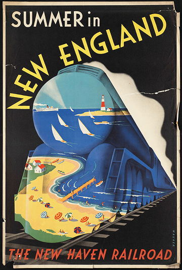
This poster for the New York, New Haven, and Hartford Railroad captures a scene of seaside leisure framed within the bold silhouette of a speeding train. The composition fuses two icons of mid-century modern life: the freedom of coastal recreation and the efficiency of rail travel. Figures lounging on the beach are glimpsed through the train’s outline, suggesting that such idyllic escapes are made possible by the very technology rushing through the center of the composition. It’s an image that sells not just a destination, but a rhythm of modernity—motion and rest intertwined. Yet, beneath its polished optimism, the poster reflects a distinctly industrial view of life, where even moments of relaxation are mediated through the machinery of progress.
Maurer, Sascha (1897-1961)
1910-1959 (approximate)
Railroad travel; Railroads; Beaches; New York, New Haven, and Hartford Railroad Company
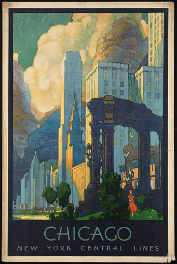
This vibrant lithograph, produced by Latham Litho & Ptg. Co. for the New York Central Lines, invites travelers to experience the energy and allure of Chicago, a city that epitomized modern urban life in the early twentieth century. With bold colors and dynamic composition, the poster captures the promise of rail travel: the ability to move quickly from one bustling metropolis to another, connecting passengers to commerce, culture, and new experiences. As part of the journey through these posters, Chicago highlights how railroads shaped not just physical mobility but also cultural imagination—painting cities as destinations of possibility while reflecting the era’s social and economic realities.
1910-1959 (approximate)
Cities & towns; New York Central Lines
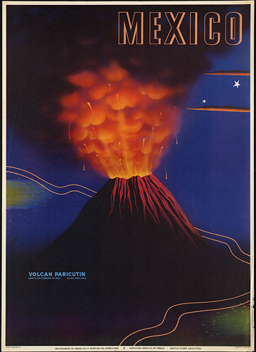
This poster showcases Volcán Paricutin, which famously emerged in February 1943. Printed in Mexico by the Asociacion Mexicana de Turismo, it captures the dramatic beauty of the newly born volcano with vivid colors and dynamic composition. The design reflects mid-20th century fascination with natural wonders and the allure of travel, inviting viewers to imagine experiencing the power and spectacle of this remarkable landscape.
1910-1959 (approximate)
Mexico : Asociacion Mexicana de Turismo (Printed at Offset Galas)
Volcanoes
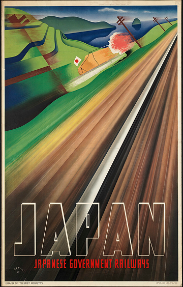
This poster depicts a high-speed train cutting through the Japanese countryside, with motion conveyed through blurred lines and a sense of rapid movement. Printed in Japan, it emphasizes technological progress and the efficiency of the nation’s rail system, presenting the landscape as a dynamic backdrop rather than a focus in itself. The composition highlights speed and modernity, framing travel as both thrilling and emblematic of national advancement.
Satomi, Mune (1904- )
1937 (inferred)
Tourism; Landscape; Railroads; Japan. Tetsudōshō
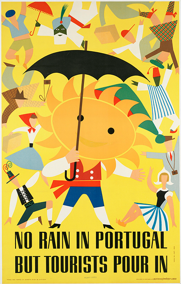
This 1954 Portuguese travel poster combines humor and national pride to advertise a climate of perpetual sunshine. The central figure, a personified sun in traditional Portuguese dress, holds an umbrella while tourists—also depicted in traditional attire from various countries—move energetically across the scene. The composition emphasizes bright colors and playful exaggeration, reflecting mid-century advertising’s optimism and visual wit. At the same time, the caricatured treatment of both locals and foreign visitors hints at the era’s simplified and sometimes stereotypical approach to representing culture.
Lisboa [Lisbon, Portugal]: Bertrand (Irmãos) Lda.
1954
Sun, in traditional Portuguese costume, holding an opened umbrella. Tourists from other countries, also in traditional costume, frolic along the sides.
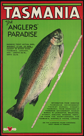
This Tasmanian travel poster, printed by Troedel & Cooper for the Tasmanian Tourist Bureau, is striking in its simplicity. Against a bright green background, a single trout is shown beside a tape measure marking 31 centimeters—a modest yet exacting image that functions as both proof and promise. By focusing solely on the fish, the poster appeals directly to anglers, positioning Tasmania as “the anglers’ paradise” through evidence rather than scenery. The design’s precision and lack of landscape suggest an almost scientific framing of nature, one that measures value in size and yield rather than in beauty or experience. In doing so, it reflects a utilitarian strain of mid-century tourism imagery, where travel was often marketed through the quantifiable pleasures of sport and conquest.
1910-1959 (approximate)
Melb., Vic., Australia : Troedel & Cooper Pty. Ltd., Photo-Print
Tourism; Trout
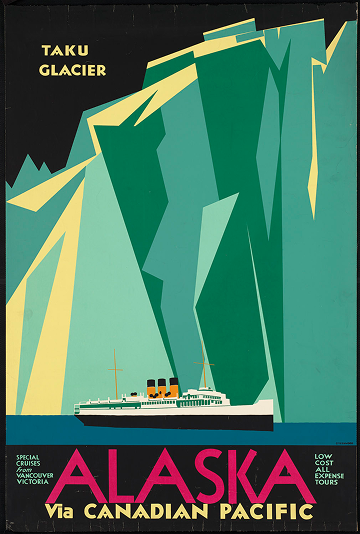
This poster presents the Taku Glacier with a Canadian Pacific ocean liner in the foreground, emphasizing the industrialized accessibility of Alaska through ocean travel. The composition is visually appealing, with bold color contrasts highlighting the icy expanse and the sleek ship, yet it simplifies and sanitizes the rugged Alaskan landscape, giving a romanticized view that prioritizes commercial promotion over geographic or environmental accuracy. The poster reflects the era’s fascination with both the remote and the modern, framing travel as adventurous but comfortably controlled. While the design effectively communicates the allure of a northern voyage, it also glosses over the harsher realities of Alaskan travel and the complexities of the natural environment.
1910-1959 (approximate)
Glaciers; Ocean travel; Ocean liners; Canadian Pacific Railway Company
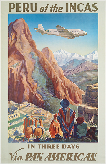
This poster juxtaposes the ancient and the modern, showing local inhabitants at Machu Picchu beneath a massive Pan American Airways plane soaring overhead. The scale of the aircraft against the historic ruins creates an uncanny contrast, highlighting the intrusion of modern air travel into a landscape steeped in history. Printed in 1938, the work frames Peru as both a destination of cultural heritage and a node in emerging global transportation networks, blending admiration for the past with the spectacle of technological progress. However, this framing imposes a Western, commercialized perspective on a deeply cultural site, reducing the lived reality of the local communities to a backdrop for tourism and aviation spectacle.
1938 (approximate)
Mountains; Indigenous peoples; Air travel; Pan American Airways Corporation
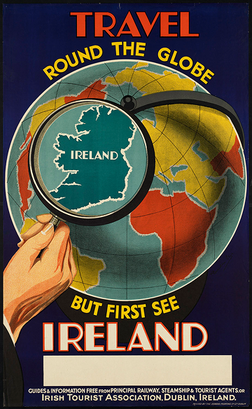
This poster presents a globe with a single hand holding a magnifying glass over Ireland, emphasizing the country as a focal point for travelers. The composition is straightforward yet conceptually clever, visually directing attention while suggesting a broader context of world travel. The imagery balances simplicity with a subtle promotional message, though the design is more illustrative than atmospheric, offering little sense of the country’s landscapes or culture beyond its geographic position. The title reinforces the idea that Ireland deserves notice before embarking on a global journey, combining a light sense of humor with national pride.
Dublin : Printed by the Ormond Printing Co. Ltd.
Globes; Hand lenses; Tourism
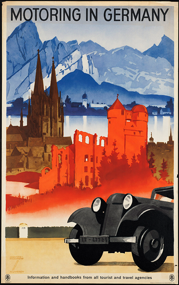
The poster foregrounds a sleek, early automobile, symbolizing technological progress and the modern conveniences of motoring. Behind it, a red castle, a city with a church, and snowcapped mountains stretch into the distance, suggesting a journey through Germany’s diverse landscapes. The composition underscores travel as both an adventurous and accessible pursuit, using the car as a visual anchor for mobility and exploration. While the imagery conveys excitement and the promise of modern travel, the arrangement of elements prioritizes spectacle over realism, creating an idealized vision of Germany where technology and tourism intersect.
Hohlwein, Ludwig (1874-1949)
1910-1959 (approximate)
Berlin : Published by the Reichsbahnzentrale für den Deutschen Reiseverkehr
Tourism; Automobile travel
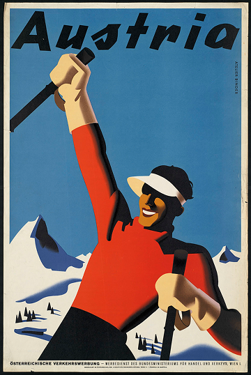
This vibrant poster captures the energy of Austria’s winter landscapes, featuring skiers in motion against a crisp alpine backdrop. Designed by Joseph Binder, the composition conveys both the excitement of sport and the allure of the mountains, reflecting early 20th-century enthusiasm for travel, leisure, and outdoor adventure.
Binder, Joseph, 1898-1972 (artist)
Wien [Austria] : Christoph Reisser's Söhne
Tourism; Skiers
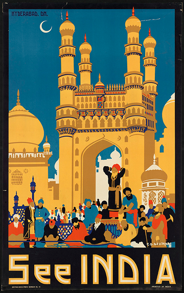
This poster presents a stylized, idealized view of an Indian city, with clean, abstracted forms and a palette of rich, vibrant colors that emphasizes visual appeal. Printed in India, it reflects a marketing-oriented approach to tourism, focusing on the city as a destination for foreign visitors rather than capturing the everyday realities of urban life. The emphasis on bazaars and bustling but organized streets conveys a sense of harmony and accessibility, almost inviting the viewer in, revealing how travel imagery of the period prioritized spectacle and commercial allure.
Bombay : British India Press
Tourism; Bazaars
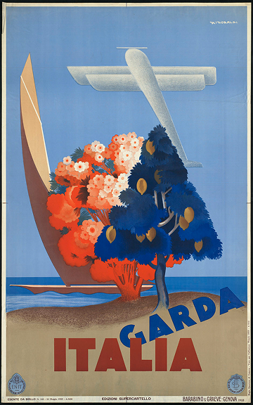
The poster presents a sunlit Italian coastline where gentle waves lap against a sandy beach, dotted with local trees. An airplane arcs across the sky while a boat drifts on the water, signaling both technological progress and the growing accessibility of travel. By juxtaposing natural beauty with modern transport, the composition emphasizes Italy as a destination open to exploration, though the scene is idealized, offering a polished, almost promotional view rather than a realistic portrayal of daily life along the Garda coast.
Riccobaldi, Giuseppe, 1887-1976 (artist)
1935
Genova [Genoa, Italy] : Barabino & Graev
Tourism; Coastlines; Ente nazionale industrie turistiche (Italy)
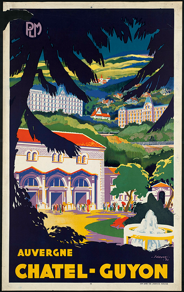
This 1932 poster for Auvergne Chatel-Guyon, created by Robert Falcucci, presents a colorful and slightly abstracted landscape dominated by a large silhouetted tree in the foreground, which frames the scene like a keyhole. Beyond it, a fountain and layered countryside with buildings suggest the region’s spa town character, though much of the detail is intentionally obscured. The composition balances decorative abstraction with a clear focal point, while the bright yellow title at the bottom draws immediate attention. While visually striking, the design prioritizes graphic impact over precise geographic representation, reflecting the period’s modernist approach to promotional imagery.
Falcucci, Robert (1900-1989)
1932
Imp. Spec: De l'agence Havas
Compagnie des chemins de fer de Paris à Lyon et à la Méditerranée
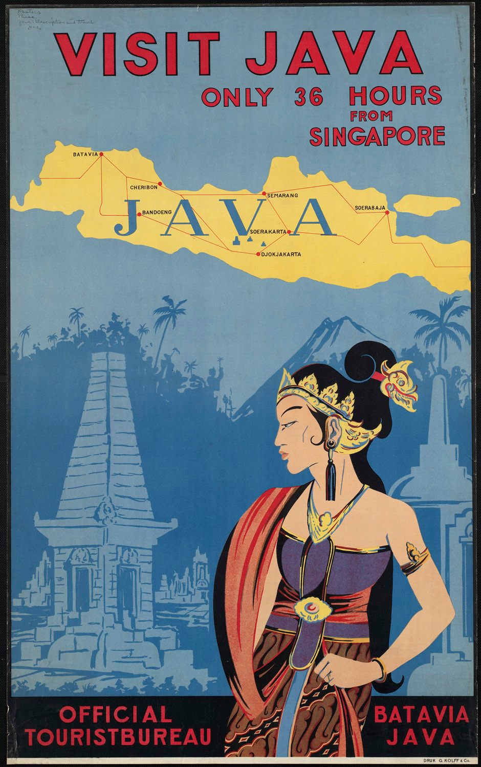
This poster presents a woman in traditional attire positioned prominently in the foreground, set against a backdrop of ceremonial architecture rendered in monochromatic blue. Above, the island of Java is mapped, situating the scene geographically and reinforcing the poster’s promotional intent. While visually striking, the composition simplifies local culture into easily digestible motifs for tourists, reflecting an external, promotional perspective rather than a nuanced portrayal of everyday life.
1910-1959 (approximate)
G. Kolff & Co.
Tourism
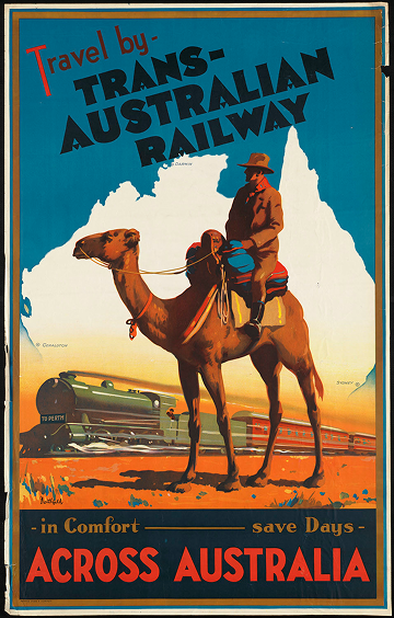
This poster depicts an outback rider on a camel in the foreground while a train speeds across the desert in the background, emphasizing the contrast between traditional and modern modes of travel. Printed around 1930, it highlights the technological reach of the Trans-Australian Railway, framing Australia’s vast interior as both exotic and traversable. The composition elevates the drama of movement and distance, yet it presents a Western-centric view of the landscape, prioritizing spectacle over the region’s inhabitants and natural environment.
Northfield, James (1887-1973)
1930 (approximate)
Northfield Studios Pty. Ltd. & J. E. Hackett
Railroads; Travel; Camels; Trans-Australian Railway
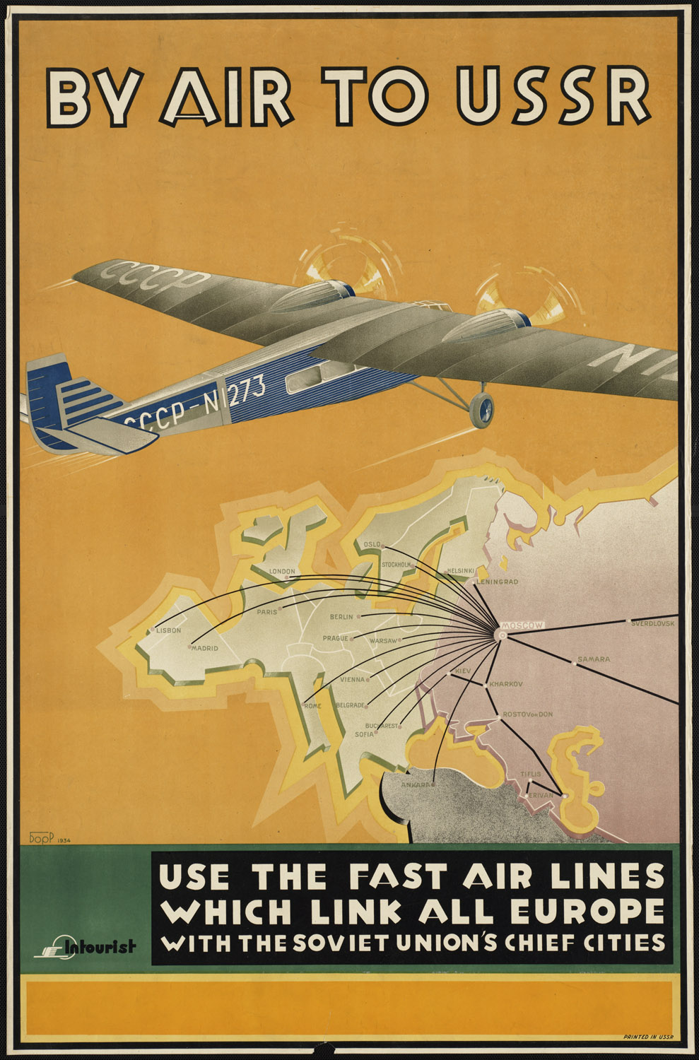
This poster promotes air travel to the USSR, emphasizing speed and connectivity, with airlines linking European cities to the Soviet Union’s major urban centers. While the design remains austere and industrial, its purpose is unmistakably promotional: advertising tourism, commercial achievement, and the efficiency of Soviet aviation. The geometrical, mustard-toned map and the modest airplane signal less glamour than Western counterparts, yet they still frame travel as an organized, modern, and economically significant endeavor.
1934
Airplanes; Air travel
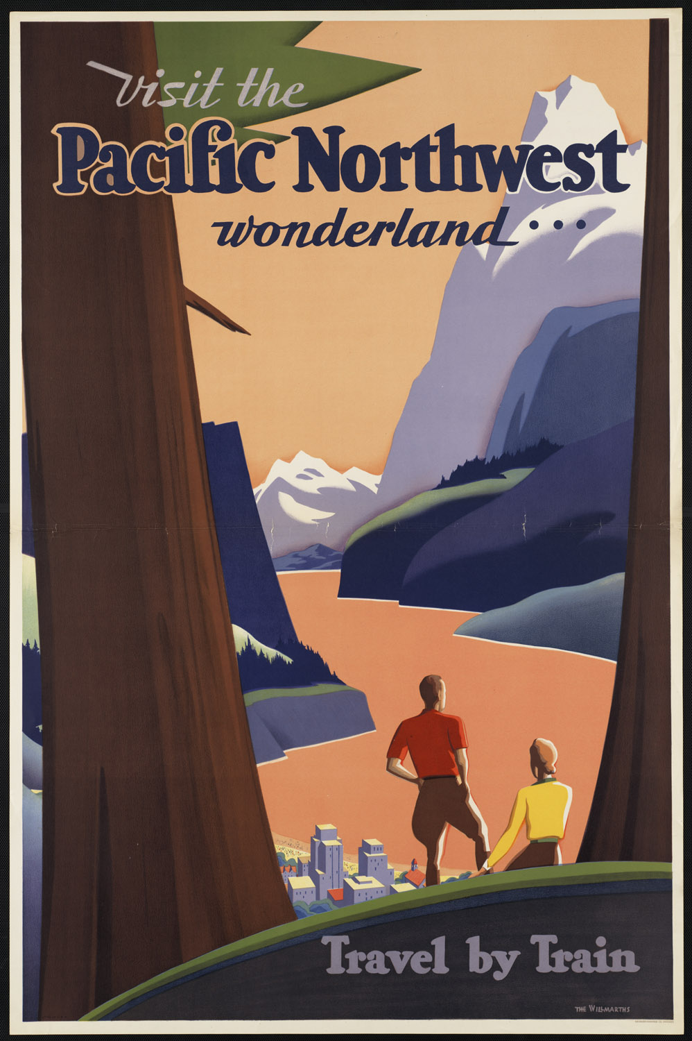
This poster depicts two travelers, likely a couple, standing among redwoods and looking out over the mountains and a city by the water. It emphasizes the natural beauty of the Pacific Northwest, with dense forests and dramatic terrain presented as a scenic destination. While the composition celebrates leisure and exploration, it also underscores the commercial intent: the promotion of train travel as the ideal way to access these landscapes, framing the region as both a wilderness to admire and a product to be consumed.
1925 (approximate)
Chicago : Newman-Monroe Co.
Redwoods; Tourism
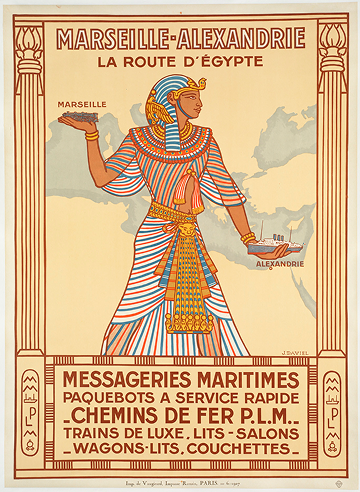
This poster depicts a stylized pharaoh positioned over a simplified map of the Mediterranean, holding a train above Marseille and a ship above Alexandria. Produced in France, it emphasizes the French perspective on Egypt as a destination defined by modern transportation and tourism rather than by local experience. The combination of railroad and maritime imagery highlights technological achievement and connectivity, while the pharaoh figure reinforces a romanticized, exoticized vision shaped by colonial-era French promotional aims.
1927
Paris : Imp. De Vaugirard, Impasse Ronsin
Tourism; Railroad travel; Ocean travel
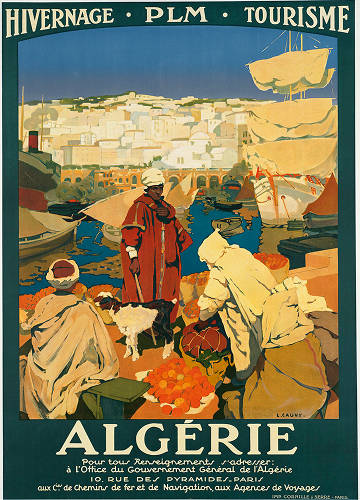
This poster depicts an Algerian port where a goat and local men move among cargo, rendered with bright, precise colors that emphasize the bustling activity of trade. Created in France, the work reflects a distinctly external perspective, presenting Algeria through the lens of French visual culture during the colonial period. The composition subtly frames the port and its inhabitants as objects of observation, highlighting both the commercial importance of the region and the power dynamics inherent in colonial representation, rather than providing a nuanced, local perspective.
Cauvy, Léon (1874-1933)
1930 (approximate)
Paris : Imp. Cornille & Serre
Harbors; Merchants
Away We Go! is a digital exploration of early twentieth-century travel posters—vivid artifacts from an era often celebrated as the “golden age of travel.” These posters, originally designed to inspire wonder and wanderlust, reveal not only the aesthetic and technological optimism of the 1920s–1950s but also the social and political hierarchies that shaped who could travel, who was represented, and how the world was seen.
Featuring selections from the Boston Public Library’s remarkable collection, this project reexamines the posters as cultural documents that reflect both beauty and bias. Their bold colors and sweeping landscapes invite viewers to imagine faraway destinations, even as they perpetuate idealized and colonial visions of place, modernity, and movement.
Organized as a virtual journey across six continents and nearly 45,000 miles, Away We Go! invites reflection on how travel has been sold, who it has been for, and how its imagery continues to influence our collective imagination. Alongside the archival works, visitors are encouraged to consider what a contemporary “poster for travel” might look like today—one that accounts for global inequality, ecological fragility, and shifting ideas of belonging.